You have run your samples through QIIME2. The denoising is done, the feature table exists, taxonomy has been assigned. You are now looking at hundreds of ASVs across dozens of samples — and the question that always follows is the same: what do I do with this now, and what are these numbers actually telling me about biology?
This is a guide through the downstream data processing using R — not a step-by-step tutorial, but the conceptual map of the analysis steps.
All figures in this guide were generated using the workflow on the Moving Pictures dataset (Caporaso et al. 2011). To run the workflow yourself, download the dataset files directly from the official QIIME2 tutorial page — they are free and always up to date: docs.qiime2.org/2024.10/tutorials/moving-pictures
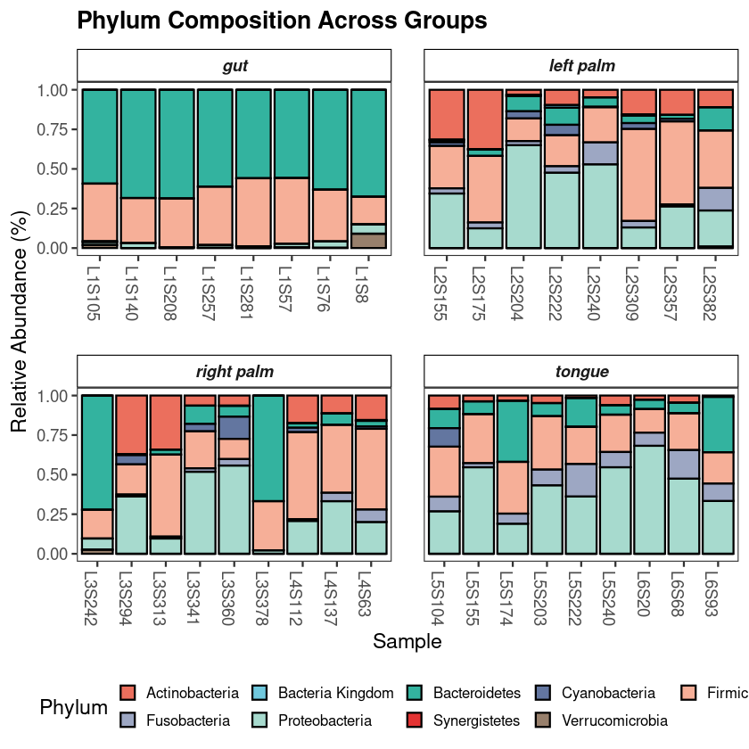
Taxonomic composition in phyloseq: phylum-level profiling with ggplot2
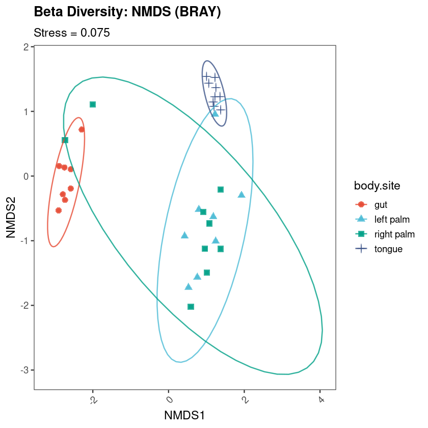
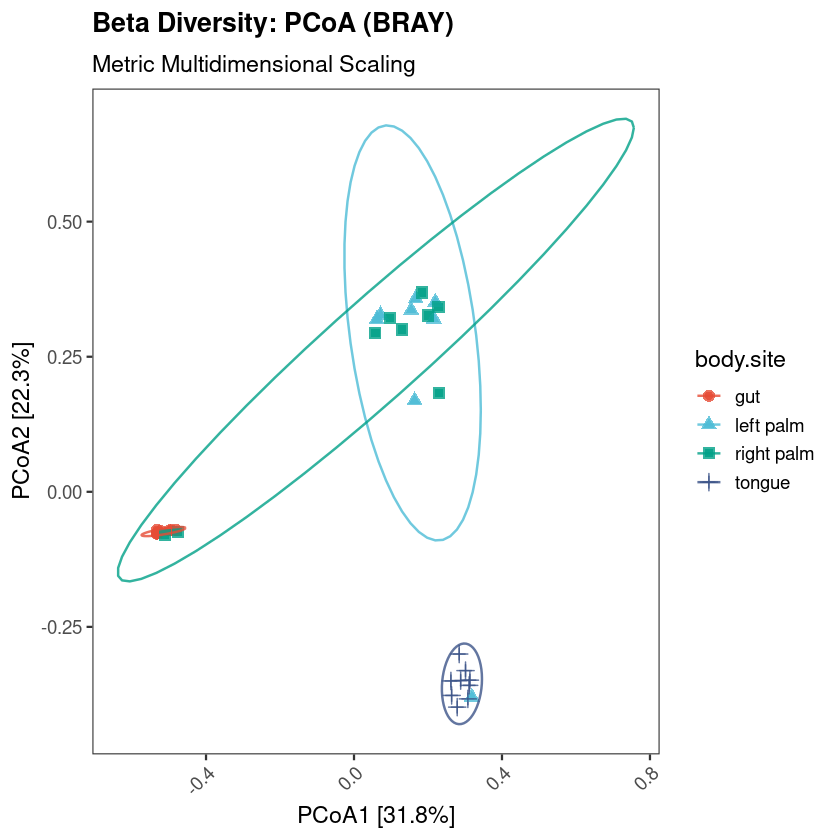
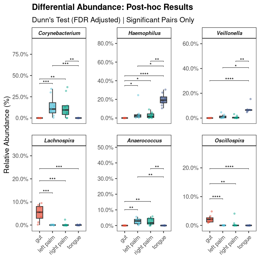
Every investigation starts with a survey of the scene. Before any statistical test, the first question is compositional: which microbial phyla dominate, and does the pattern vary across groups? If it does not, everything downstream will be harder to interpret. If it does — as it almost always does across distinct body sites or conditions — you already have your first biological result.
The standard approach aggregates ASVs to phylum level, normalizes each sample to relative abundance, and displays the result as stacked bars. This visualization is intended to provide an initial overview of the community structure, allowing you to spot broad patterns between groups before moving to more granular statistical testing.